
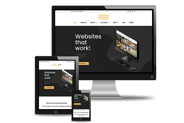
Responsive Website Design is web design aimed at creating sites that provide an optimal viewing experience: easy reading and navigation with a minimum of resizing and scrolling, across a wide range of devices, from mobile phones to desktop computer monitors. A site designed as responsive adapts its layout to the viewing environment by using fluid, proportion-based grids and flexible image. Each page element sizes in relative units like percentages, rather than absolute units like pixels or points.
Why is a Responsive Website a good idea?
Because of the ever-changing landscape of web browsers and toys we use to look at the internet!
A few years ago, the web design community started creating dedicated mobile versions of websites. Every website would have its normal ‘desktop’ version, and a bonus ‘mobile’ version. Yes, at twice the work, and sometimes double the cost. In hindsight, this seems pretty silly, but at the time it seemed reasonable.
Computers, tablets, phones of all sizes
Luckily, technology kept marching on! Not long after the mobile phone market had revolutionized web-viewing, other devices surged in popularity. In addition to phones and personal computers, tablets and small notebook computers started appearing… everywhere.
Soon, iPads blew the market wide open. The development of new devices were not just aimed at getting smaller- large, high-resolution displays started to become much more common. Today, 27″ and 30″ monitors are frequently found in homes and offices and used daily for surfing the web. ( Wait..does anyone ever use that term…SURF… anymore??)
Mighty Morphing
So, a website technology that could allow a website to morph and be seen on all these devices was needed… and was born. With responsive, you can browse the web on phone or tablet just as easily as you can browse the web on a desktop or laptop computer. One price, one place for updates, one hosting. Boom. Smart marketing starts with a responsive website.