Image of Frog with hand over eyes

That’s one mighty UGLY (type) face!

You work in this biz long enough, and you get to know a lot of faces. Typefaces, that is. We love the fact we now have a bazillion faces to choose from, and the list is growing daily.

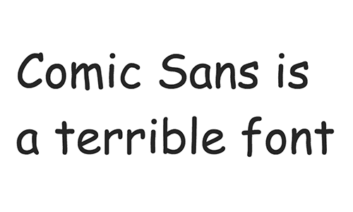
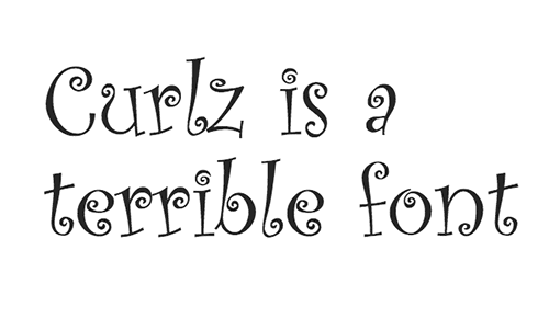
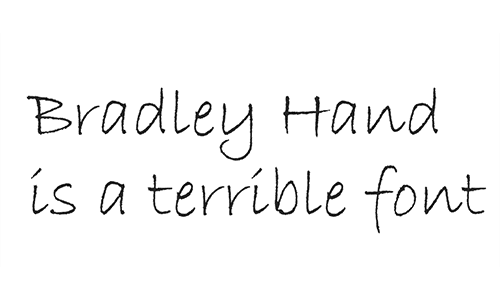
With all those purdy faces out there, you gotta wonder WHY, WHY, WHY in the name of humanity and all that is sacred in the world, do people select some really butt-ugly, hard to read fonts for their logotypes and literature?

Comic Sans

Every kid’s party place or preschool thinks this is cute and kiddie- like and fun (correction, that should be fun!!! with multiple exclamation marks). It’s not fun nor is it fun!!!! It’s just poorly designed, and has bad, bad spacing issues. So stop the insanity now. Here is some more light reading on the topic.

Comic-Sans is a terrible font

Papyrus
Papyrus is supposed to look Middle Eastern, Biblical, scholarly. This was selected as the title font for the movie Avatar. I saw it up there on the silver screen and cringed in my seat. But, the font choice didn’t seem to hinder the movie’s success. To date, Avatar is one of the highest grossing film ever…$2,782,275,172 and counting. Go figure.

Papyrus is a terrible font

Brush Script
Come on. A font is a font. Don’t try to pretend someone is in your PC with little paint brushes. Ugly, unbalanced and ugly. And it’s ugly.

Brush-Script is a terrible font

Curlz

Unless you’re a 9 year old child in pink tights, inviting your little friends over for a My Little Pony Party, you have no excuse for using this one. Please put your adult pants on, and don’t use Curlz. Erff… even typing the name CURLZ makes me a bit queezy.

Curlz is a terrible font

Bradley Hand
Bradley Hand attempts to look like a note that someone quickly jotted down, but it just comes across as tacky, olde-school and ugly. The intentional imperfections in Bradley Hand are designed to make it look like genuine handwriting, but these imperfections make it almost impossible print correctly, leaving jagged fuzzy edges around each letter.

Bradley-Hand is a terrible font

Vivaldi
If you want your print media to look like a tacky wedding invitation, Vivaldi is your font. Vivaldi is the go-to font for mimicking handwritten calligraphy, but the balance and scale are all wrong. And the capitals are indecipherable. Plus, with all those all those loops and curls, it’s a headache to read. Pssst: your audience knows you typed this on a computer, don’t try to pretend otherwise.

Vivaldi is a terrible font

Ok. I’m done. I feel much better now. Thank you.

Let Devine Design promote your business, organization or association with a great looking custom-designed website that contains important content, looks great, functions seamlessly, and is search engine friendly. Call us at 845-783-9291 or contact us here.